
The Monday-Morning Spreadsheet Pileup
Picture this:
It’s Monday at 8:30 a.m.
You open your inbox and see:
-
“Final Budget v9 – use this one.xlsx”
-
“Budget_final_FINAL (Kishon edits).xlsx”
-
“Copy of Budget final_FINAL (Board version).xlsx”
Every department has its own version. Someone overwrote a formula. The totals don’t tie to QuickBooks anymore. You were supposed to have a “quick summary” ready for the CEO an hour ago.
You can wrestle your way through it. You always do. But the nagging feeling won’t go away:
“There has to be a better way than living inside 25 linked spreadsheets.”
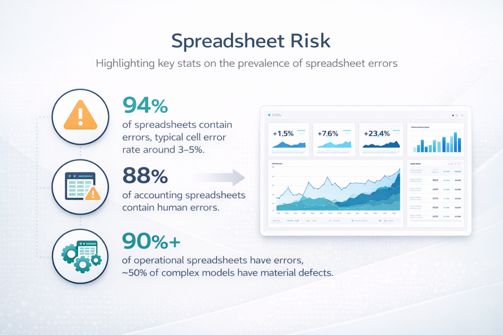
You’re not imagining the risk. Studies of real-world spreadsheets routinely find errors in the vast majority of them. A synthesis of multiple audits found that roughly 94% of spreadsheets contained at least one error, with typical cell error rates around 3–5%.
In finance and accounting specifically, one industry review noted that nearly 88% of accounting spreadsheets examined contained human errors. And a separate summary reported that more than 90% of operational spreadsheets have errors and about half of complex spreadsheet models have material defects that could affect decisions.
Spreadsheets are still incredibly useful. But they’re no longer enough—especially if you want a finance function that’s fast, scalable, and ready for automation and AI.
That’s where dashboards come in.
This article is a practical, finance-focused guide to moving from spreadsheet-only reporting to a dashboard-first mindset—without throwing away the good things about Excel.
We’ll cover:
-
Why spreadsheets took over finance (and why they’re struggling now)
-
What dashboards actually are—and what they’re not
-
The telltale signs you’ve outgrown spreadsheet-only reporting
-
A step-by-step roadmap to your first finance dashboard
-
How dashboards and spreadsheets can happily coexist
-
A sample “starter” dashboard for a small business
Why Spreadsheets Took Over Finance (And Why They’re Struggling Now)
Spreadsheets won for three big reasons:
- Familiarity. Almost every finance professional grew up with Excel.
- Flexibility. You can model anything: a 13-week cash forecast, a SaaS cohort analysis, or a nonprofit grant allocation.
- Low cost. You didn’t need IT, procurement, or a six-figure BI budget to get started.
Even today, estimates suggest that around 80% of businesses still rely on spreadsheets for core tasks like financial modeling and forecasting.
But the same qualities that made spreadsheets so powerful now cause headaches:
- Error-prone. Manual data entry, copy-paste, and complex formulas create plenty of opportunities for mistakes. Research across multiple studies consistently finds error rates in the majority of real-world spreadsheets.
- Weak controls and audit trails. Most spreadsheet tools don’t give you a robust way to see who changed what and when, which is a problem for compliance, financial reporting, and audits.
- Version chaos. Files live on laptops, in email threads, and on shared drives with names like “Forecast_final_v7_new_new.xlsx.”
- Hard to scale. As your business grows, your spreadsheet models often become fragile webs of links and hidden sheets.
- Tough for automation & AI. Modern analytics and AI tools need structured, documented data and logic. Legacy spreadsheets tend to be the opposite: inconsistent formats, opaque formulas, and minimal documentation.
In other words: spreadsheets are still great for thinking and exploring. They’re terrible as the single source of truth for a growing business.
Dashboards exist to fix that.
What Dashboards Actually Are (And What They’re Not)
At its core, a dashboard is a visual, interactive summary of your key metrics, updated automatically from underlying data sources.
Business intelligence (BI) platforms describe dashboards as consolidated views of current and historical performance that help teams make informed day-to-day decisions.
A modern dashboard typically:
- Pulls data directly from systems like your accounting platform, CRM, or data warehouse
- Calculates standardized metrics (e.g., gross margin, churn rate, AR days)
- Presents them in charts, tables, and scorecards
- Lets users slice and filter (by customer, product, region, time period)
- Updates automatically on a schedule or in near real time
BI research shows that when dashboards are deployed well, organizations see better decision-making, improved efficiency, and stronger insight into performance, even in small businesses.
Just as important is what dashboards aren’t:
- They are not a magic button that cleans bad data.
- They are not meant to replicate every spreadsheet you’ve ever built.
- They are not trying to replace Excel as a modeling sandbox.
Think of dashboards as the “front window” of your data house: a clean, consistent view of the most important facts, refreshed daily (or hourly), designed for fast understanding—not for doing complex what-if analysis on the fly.
Signs You’ve Outgrown Spreadsheet-Only Reporting
How do you know it’s time to graduate?
If any of these sound familiar, you’re ready:
- Reporting takes too long. Closing the books is fast, but preparing management and board reports takes days of exporting, copying, and pasting.
- No one is sure what the “real” number is. Sales has one revenue number; finance has another; the CEO has a third pulled from a CSV last week.
- You’re afraid to touch the model. Changing one assumption risks breaking 20 linked sheets. The person who originally built it is long gone.
- Audit and compliance are getting harder. Reviewers ask why a number changed, and the only honest answer is, “Someone must have edited the spreadsheet.”
- Leaders want answers now, not next week. Executives and founders are asking for more frequent, more visual updates—especially on cash, runway, and unit economics. BI dashboard case studies show that executives adopt dashboards quickly because they can see trends and issues in seconds rather than digging through reports.
Individually, these issues are annoyances. Together, they’re a signal: the business has outgrown a spreadsheet-only approach.
A Pragmatic Roadmap: From Spreadsheets to Dashboards in Five Steps
You don’t need a data warehouse, a team of engineers, and a six-month project plan to start. You can move in stages.
Step 1 – Decide Which Questions Matter Most
Before you open any BI tool, answer a simpler question:
“If we had a live dashboard in front of us right now, what decisions would we want it to support?”
For a typical small or mid-size business, that might include:
- Cash & runway. How many months of cash do we have? Are we on track to hit our covenants or runway targets?
- Revenue & margin. What’s happening to top-line growth, gross margin, and major product or service lines?
- Customer metrics. Which customers or segments are growing? Which are churning or shrinking?
- Operational efficiency. Utilization, project margin, backlog, or other operational KPIs.
BI best-practice guides emphasize that dashboards are most effective when built around a small set of clearly defined KPIs instead of dumping every metric you can think of onto one page.
Make a short list (5–10 metrics) and define each one in plain language.
Step 2 – Fix the Foundations: Data and Definitions
A dashboard is only as good as the data underneath it.
This is where your spreadsheet experience is actually an advantage: you already know where the bodies are buried.
Key tasks here:
- Standardize metric definitions. What exactly counts as “Active Customer,” “MRR,” or “Project Profitability”? Different teams may be using different definitions today.
- Connect to source systems. Pull data directly from accounting, CRM, HR, or project systems instead of exporting CSVs manually.
- Clean and transform. Use tools like Power Query, ETL pipelines, or simple scripts to tidy up inconsistencies (date formats, customer names, chart-of-accounts mappings).
Modern BI literature stresses that self-service dashboards work best when there’s a governed semantic layer—a shared, centrally defined set of metrics that everyone uses—rather than every team building their own versions.
Investing a bit of time here saves you from the “dueling dashboards” problem later.
Step 3 – Choose Your Dashboard Tool (and Keep It Simple)
There’s no shortage of tools: Power BI, Tableau, Looker Studio, Qlik, Metabase, and dozens more.
Recent comparisons of self-service BI tools highlight a few things you should look for:
- Direct connectors to your key systems (e.g., QuickBooks, Xero, HubSpot).
- Row-level security so you can safely share reports with different teams.
- Easy visualization and filtering via drag-and-drop.
- Scheduled refresh and simple sharing (URL or embedded reports).
You don’t need to pick the “perfect” tool. You just need one that:
- Fits your budget
- Plays nicely with your data sources
- Your team can actually learn and maintain
For many finance teams, starting with Power BI (if you’re already on Microsoft 365) or Looker Studio (if you’re deep in Google) is a pragmatic choice.
Step 4 – Design Your First Dashboard for Humans, Not Robots
This is where the fun begins.
Some design principles that consistently show up in successful BI implementations:
- One screen, one story. Your main dashboard should fit on a single screen without scrolling on a laptop.
- Use a simple layout.
- Top row: big number “scorecards” – revenue, cash, margin, active customers.
- Middle: trend charts (e.g., revenue and gross margin over time).
- Bottom: detail tables with filters.
- Limit colors. Use one highlight color (say, your LedgerLogic teal), one neutral, and red for true problems.
- Add context. Year-over-year comparisons, budget/forecast benchmarks, and clear labels turn charts into decisions.
- Keep interactivity purposeful. Filters for time, customer, and product; avoid 20 different slicers that confuse users.
Pilot the dashboard with a small group: CEO/founder, finance lead, maybe one operations leader. Ask:
- What’s confusing?
- What did you want to click on that wasn’t there?
- If you could only keep three tiles, which ones would you keep?
Adjust accordingly.
Step 5 – Operationalize and Govern
The last step is turning a nice demo into part of how you actually run the business.
That means:
- Agreeing on ownership. Who maintains the data connections, metric definitions, and security settings?
- Scheduling refreshes. Does the dashboard update nightly? Hourly? After month-end close?
- Documenting definitions. A simple “metric dictionary” that explains each KPI and where it comes from.
- Training end users. Short Loom videos or lunch-and-learns walking through “How we use the Finance Health dashboard.”
Research on self-service BI emphasizes that the biggest failures happen not because of bad tools, but because organizations don’t invest in governance and user enablement—leading to confusion and distrust of the numbers.
You don’t need a corporate-grade data governance council. Just a lightweight agreement on “who owns what” and a regular review.
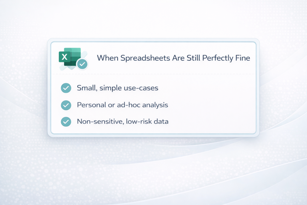
Dashboards and Spreadsheets: A Better Division of Labor
Here’s the part your inner Excel power user might appreciate:
The goal is not to kill spreadsheets. It’s to give them the right job.
Industry commentary is starting to converge on this view: spreadsheets are still essential for analysis and modeling, but they’re fragile as core systems of record and reporting.
A healthy division of labor might look like this:
- Dashboards
- Single source of truth for recurring metrics
- High-level views for leadership and teams
- Automated, governed, and secure
- Spreadsheets
- Ad hoc analysis, scenario planning, and scratch-pad thinking
- Detailed one-off models (e.g., new pricing structures, capex planning)
- Temporary “labs” that produce logic later codified into governed systems
Over time, the best of your spreadsheet work (for example, a clever cash-flow calculation) can be promoted into the dashboard layer, where it’s tested, documented, and maintained centrally.
What a First Finance Dashboard Might Look Like
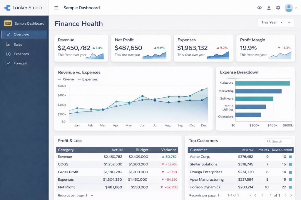
To make this concrete, imagine a “Finance Health” dashboard for a service-based small business.
Top Row – Scorecards
- Monthly Recurring Revenue (MRR) – current month vs last month vs same month last year
- Gross Margin % – with green/amber/red thresholds
- Cash on Hand (months) – cash ÷ average monthly operating expenses
- AR Days (DSO) – average days to collect receivables
These align with common metrics BI vendors highlight as critical for understanding overall performance and liquidity.
Middle Row – Trends
- Revenue & Margin over 12–24 months – line chart with budget/forecast overlay
- Cash Balance over time – including projected runway based on forecast
- AR Aging Trend – stacked area showing current vs 30, 60, 90+ days past due
BI dashboard guides emphasize that visualizing trends—not just static numbers—is key to evolving from reactive to proactive decision-making.
Bottom Row – Details
- Customer Table – revenue, margin, AR balance, last invoice date, with filters by segment/region
- Project/Engagement Table – for service firms, showing active projects, budget vs actual, and margin
Add a couple of simple filters (time period, region, segment) and you’ve got a dashboard that:
- Tells leadership how the business is doing in under 60 seconds
- Gives finance a shared language for conversations with operations and sales
- Replaces several recurring spreadsheet reports with one consistent view
Take-Home Message
If you take nothing else from this article, take this:
Spreadsheets are phenomenal tools for thinking. Dashboards are phenomenal tools for running a business. You need both—but for different jobs.
When you move core reporting from a jungle of Excel files into a small set of clean, governed dashboards, you get:
- Fewer arguments about “whose number is right”
- Faster decisions based on the same, trusted view
- Less time copying and pasting—and more time analyzing and advising
- A finance function that’s ready for automation and AI, not blocked by fragile models
If your reality today is still “Budget_final_FINAL_v7.xlsx,” a good first step is simple:
- Pick one recurring report that always causes pain—say, your monthly management pack.
- List the 8–10 metrics that truly matter.
- Build one dashboard around those, and see how it feels to manage from a live view instead of a static pack.
And if you’d like a partner to help translate your existing spreadsheets into dashboards—without losing the nuance buried in all those formulas—a fractional CFO / analytics team can do exactly that: take your ledger and turn it into insight, logically.